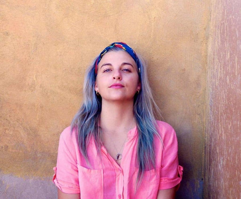
Scarlet Alexandra is an illustrator who creates colourful artwork that celebrates the world’s vibrant cities and towns. We spoke to her about how she started Sax Doodles and the hurdles and accomplishments she faced with setting up her website. If you’re thinking about setting up your own art store, you’ll want to hear Scarlet’s brilliant advice!
Tell us a bit about yourself and how Sax Doodles started?
I’m Scarlett and Sax Doodles was basically a bit of a lockdown, “I’ve got nothing else to do” project. I just quit my job in the January pre-COVID and moved to London. I decided I was going to start looking for new jobs, then we went into lockdown and I was like, I haven’t actually got anything on! So I started drawing from YouTube tutorials because I had bought myself a digital pad. I decided I was going to use the time to learn how to use Illustrator. Then I thought, oh, what if I draw? I decided i’d just draw the town I lived in for now because I know it so well, so I started drawing that from memory.
I grew up in the south of Spain so most of the artwork started near and around there. I was doing a kind of reimagined travel poster of the village that I grew up in, putting that on Instagram then people started asking if they could buy them! And I said, well yeah.
I started developing more travel prints in that particular area and I realised I needed to find a printer. I actually did a couple of trials of different printers. I just didn’t like the quality. I then decided, if I was going to do this, it had to be good quality. That’s then how I started using theprintspace.
I love that you have the option to have limited editions, and I thought that it was a really great way to force yourself to keep drawing, because if you can sell something 10,000 times, then you’ll just sit on that one thing. But if I make them limited to 100, then it forces me to have to keep on coming up with new ideas. Slightly because I procrastinate a bit, but that’s a really positive thing to have to kind of force myself into being more creative.
Do you create all your illustrations from memory?
It’s a mixture. A lot of it comes from me scouring Google Maps or if i’ve been there in person taking photos. What I didn’t want to do was just take that building on that street or that bar, I wanted it to be an amalgamation of all the different places in that area. So recently I did one of Soho. Now, the drawing isn’t actually of a real place in Soho, it’s just an amalgamation of three different buildings and streets.
On the whole, I’d much prefer to do spaces that I’ve lived in or that I’ve visited. Just because I think that you get a much better sense of the place when you have an emotional connection to it.
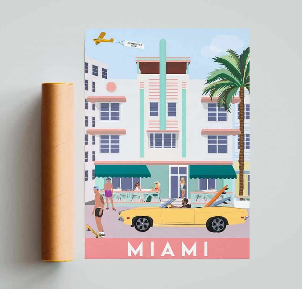
I went to Miami last December, it’s an amazing place. I don’t think I would have understood or appreciated that had I not been there. You can create something from a photo but I don’t think it’s as easy to capture the energy and space. For example, in the Miami poster there’s an old guy, literally in his swimming trunks with a beer in his hands because that’s Miami, everyone’s walking around in their underwear, no matter what.
How did you decide which website template to use?
When you’re using a template, that’s not necessarily you building the website. That’s the great thing about using an E-commerce platform like Shopify, because it gives you everything you need. You’re then able to amend the size of the text etc. There might be a little bit of HTML that comes into it, but not a huge amount.
I used one of the templates that you can choose through Shopify, I wanted it to be as clean as possible and easy to use. I think a lot of the time people get really wrapped up in making an amazing website, but when all their customers want to do is find a specific product.
My website is laid out as follows; home, shop, contact. The shop section is sectioned by continent. One day I would love to have more, but it would then be separated into further tabs by country. It was really important to me that it was the artwork that was taking precedence, not some fancy website. I used to work in digital marketing and whether it’s social media, websites etc, on average you have three seconds to impress someone. So we all need information that is quite concise, and really easy to use.
The idea was that I wanted it to be divided by region so that people can just see it there and then. I then have every new print addition on the homepage so that when someone lands on my website, they can immediately see the newest pieces and they can see if they’ve missed anything. it’s just a really easy way to navigate.
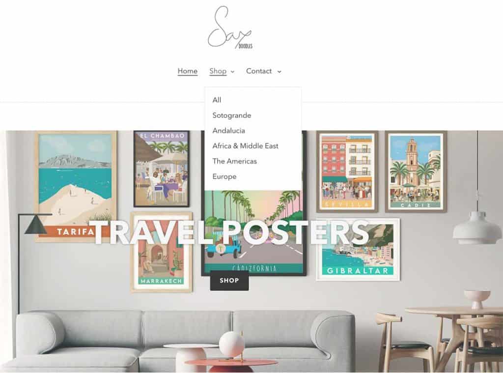
I’ve organised it by collection and each collection is your location. So you could create as many different collections as you want, and then highlight those on the search tab. You just keep going as you add more to it. So it’s really easy to use. I think that’s kind of the main thing, I didn’t really want to get bogged down and spend too much time on the business side of it, I wanted to spend more time doing the drawings.
How did you start selling art prints and did social media play an early part in this?
I started a separate Instagram from my personal account, just to put my work out there more and keep it all in one place. I’m still working on the brand name, I just haven’t really had the time because things have kind of blown up a little bit. But essentially, ‘SAX Doodles’ evolved because my middle name is Alexandra. I used to work in interior design and my design portfolio was always ‘SAX Design’. So then it was just SAX doodles.
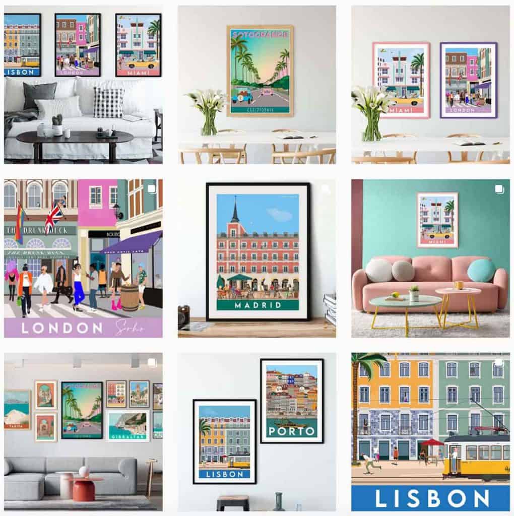
Instagram has been an amazing tool. I mean, it’s tricky, because the algorithm is always changing and there’s been so many massive changes. Photos don’t really work on Instagram anymore and the trends this year, and going forward, are focusing on videos. For me to create content that’s relevant to my practice, I need to create video content, which is time consuming. People want to see the process, but it’s not always easy to record your screen whilst you’re drawing because a drawing might take three weeks.
I think it’s hard to quantify engagement on Instagram in terms of selecting work to sell, if the work didn’t get any likes that doesn’t necessarily mean it won’t sell well or it’s not as popular, it’s just the algorithms changing. If you spend money doing paid ads, then your algorithm is screwed after that, you’ll see an absolute drop in engagement. An organic post i’d maybe see 400 people viewing it and 100 people interacting, then i’d do a sponsored ad where 4000 people see it. For example, doing a sponsored ad for something such as a travel programme works really well because you can target people in that specific area and that can lead to getting results. But at the same time, everything you post afterwards is completely irrelevant.
Every time I do a sponsored post or ad, I then do a giveaway to try and boost the engagement again afterwards. But that’s my way of getting people to comment on the post and then bring the engagement up again. It’s like this balancing act of paid versus natural and organic.
I do see results if I post something on Instagram as I get an order. Sometimes you release a new print that you’re really excited about, you have a whole marketing strategy, spend all the time creating the content, then you post it and you don’t get any engagement or orders.
I think that trying to balance your marketing leads to being more than just social media is important. For example, last year I managed to persuade the local magazine where I live to use one of my prints as the front cover. It was amazing because 10,000 people in this village saw it, it was a great way to market my work. But you can’t really get away with that everywhere in the world. There would come a point where I’d need to take on a PR team and all that kind of stuff, and you have to figure out the prices. But right now, the sacrifice of having to give away a print to boost your engagement after spending money on sponsored ads is a lot less than paying for publicity.
I just think that as an artist you need to diversify where you get your work out, I think a lot of people are very reliant on social media but it’s not always the best way to do it. It’s not always great for your creative development and it doesn’t always work, I think that’s a really important thing to remember.
What hurdles have you come across when setting up your online art store and how did you overcome them?
I think one of the hurdles, which is absolutely of paramount importance, and which is why I worked with theprintspace, is that you have printers in both the EU and in the UK. Had I not been able to supply prints to the EU without custom charges, then my business would have collapsed. The majority of my clients are in the EU and the majority being in Spain. That would have been absolutely devastating to the business because no one wants to pay for unexpected custom charges.
It would have been really tricky as a small business to navigate all of the red tape, import duties and tax. Who would you charge tax to? How would you charge it? How do you do all that kind of stuff?
I think that if you are an artist in the UK looking to sell outside the UK, make sure that you have requirements to sell in the EU, because that’s going to be a really big market, but don’t make it at the cost of the client. People aren’t interested in importing and exporting stuff at the moment until it’s all been finalised and they know how much it’s going to cost. When it comes to art, especially art in the UK, people are very used to being able to have that free trade between the EU. I think that it’s really important that you do your homework, and you look at where you’re going to be selling, how it’s going to get there, what costs might incur.
Is there any other data you look at to try and identify your audience needs?
There’s one which is really interesting, when you have a customer who converts on your website, you can see how many days that person spent browsing, how many days it took them to come back and where they originally came from. Sometimes it says they came directly to your website via Google. But because my SEO needs work, I know I’m not going to be the first search term, it’s obvious someone sent them the recommendation of the name or something like that.
I would say my target audience is probably 35/40 years old. I wouldn’t say that the artwork necessarily makes you think of that type of audience. But I think that the price point is people who think, “Oh, that’s a really cute gift for someone.” or “Oh, I’ll put that in my downstairs Loo”, that kind of thing. People who are younger are maybe purchasing prints of areas they love or used to live in.
I think the really interesting thing when it comes down to deciding what artwork to create, is seeing what people have been searching for. You can see when someone searches for a product on your website, for example say they search the word ‘Madrid’ and there’s no result, it will ping you and tell you that 20 people searched for Madrid, and they didn’t find it. So then you know people are looking for that particular product and you should create that drawing. You can look back as far as your website was created, and over time you’ll see the same locations appear, you can then export that into an Excel file and use it as a list to tick off the locations as you create the work.
Being interactive with your audience on social media and asking the questions is also important. I use Photoshop to mock up files of rooms and drag and drop the artwork, that way I’ve always got loads of content that I can use. You can then put those on an Instagram story and ask “Where are you guys going on holiday next? And then put the question box under and ask your audience where they would like to see Illustrated next, all that kind of stuff.
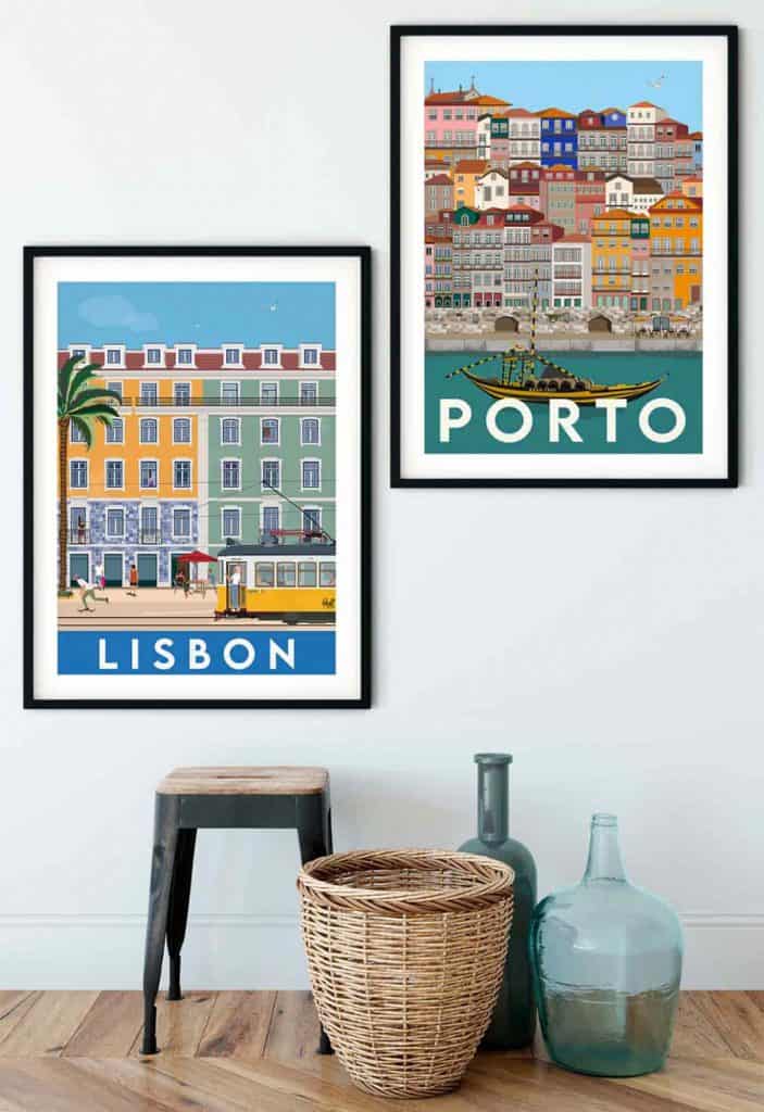
If i’m drawing London, it’s not Buckingham Palace, it’s not the London Eye etc. It’s so hard because at the end of the day, people who are coming to London, that is the ultimate London experience, like walking around London and seeing those monuments. And it’s not to say that I won’t do one of Camden or whatever it might be. But I think it’s not just doing the typical monuments because I think there’s so much of that out there. It’s not necessarily that I don’t love Madrid for its monuments. I love Madrid for its vibe, I love its people, the food, the colours. It’s not that they’ve got a really great museum or that really old buildings (which obviously are important) but I don’t necessarily want that on my wall at home.
Every time I think of doing something new, I always search through images on the Pinterest app, Google Images and travel posts and I realised there’s so few that have people in. Surely places are all about the people? That’s why I’ve started to now be a bit heavier on the people aspect. I feel like it is so important, because what is a place without its people?
Do you think the mock ups of the different rooms and layouts benefit your sales and creates more engagement?
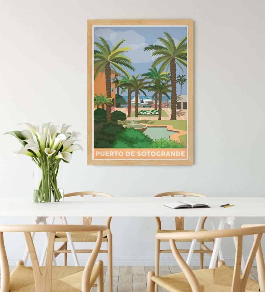
I think that it’s really important for people to be able to visualise size. I used to work in interior design, and one of the major things people could never quite visualise was what things were going to look like, we were often asked questions such as; how is it going to fit in that space? Or how tall is it compared to the windows? I used to do 3D renders of entire buildings and homes and interiors, that was a really major part of our business as designers. We needed to make sure that our clients could visualise and understand what it was they were buying or what the concept behind the design was. I knew when I came to create prints, that people needed to understand what the size is, so if it’s sitting next to an armchair, it’s that big, or it’s this big. If you tell someone it’s A3 or A2, a lot of people people don’t have concepts of exactly how, or what the progression of paper size is and it can be confusing.
I think that it also gives people an idea of what it could look like in their home or how you could dress it. You could put it in a pink frame, a black frame or wooden frame and give people that inspiration of not only the artwork but the actual final product can be a creative piece.
What piece of advice would you give to people that want to take the leap, and not just set up their store, but start creating more?
I never intended for this to be my full time job and to be honest, it isn’t even my full time job. It’s kind of my permanent side hustle. It’s something that I spend some hours a day on, some days are really busy and other days are less so. I think that if you’re really excited or inspired by something, you’ll stay up until midnight or when you get home from work and draw. Every time your phone pings and someone buys something that you made, it’s such an amazing feeling. I still get excited. It’s terrifying, but at the same time you don’t really lose anything. What does it cost, 20 quid to set up a website? And then it’s down to you putting the art out there.
For example, theprintspace, I pay for it, they print it. Then you’re never really going to be losing anything. I mean, I started this business with literally £50, a lot of time and a lot of dedication.
But I think if it was to be someone’s side business, you’d quite quickly determine how much of a side and how much of a main business you want it to be, depending on how it feels when you make those sales. There is a lot of work that goes into it. But I don’t think that it’s something that you necessarily have to sacrifice a full time job for, you can see how it goes if you’ve got the artwork ready. If you’ve got it ready, and take the plunge, what is there to lose? You’ll create a website and maybe no one will go on it, but maybe they will.
