In this article, we are going to show you how to successfully plan, launch, and market a time-limited print sale. But before we start telling you how, let’s start with why you should care. Art helps to bring joy, happiness and meaning into people’s lives. It can lift their spirits, make them feel emotions, and connect them to the place it is displayed in (like their home) and help connect them with likeminded people who enjoy the same kind of work and share the same belief systems.
So far so good! Here’s the rub; art is a discretionary purchase. It is therefore a harder purchase for people to justify in their own minds than things which they see as absolute necessities. It might be one of the best purchases they ever make, but they need a little nudge to make it. That’s where the timed print sale comes in. The scarcity and urgency that this style of sale brings is the incentive they need to go ahead and make the purchase.
Another reason that the timed print sale is good is that it enables you to launch distinct projects as stand alone sales. This is really useful to advance a current theme in your work and talk about it.
Lastly the timed print sale approach helps you to compartmentalise your marketing and sales efforts. You can focus on the print sale for 4-6 weeks, make some revenue, and then move on and give yourself the freedom and focus to make new artworks. Ok, let’s jump into the plan!
Your 6 week plan
You are going to launch your time-limited print sale over a 6-week period. In terms of how you distribute your time, we would recommend dedicating 1 full day, ideally at the start of the week to plan the week ahead. Then each day you’ll need to spend 1-2 hours executing the strategy and content we outline in the following sections. To help with this, we would highly recommend using a social media scheduler such as Later and Mailchimp to automate your marketing emails.
We have put together a 6-week launch plan that gives you a clear conversation framework. Here is how that looks:
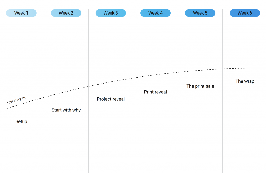
Ok, we are now going to walk you through each stage of the 6-week plan, with content examples.
Week 1: Setup
Whilst we have included this step as part of the launch chronology, it is likely you have already done these setup tasks as part of your store launch or if you followed our marketing 101 course. If you have not, or for a recap on what you need to get set up before you can market your art print sales, then use this checklist.
Week 2: Start with why
Your ‘why’ ‘where’ who’
Why do you do what you do? What are your deep rooted motivations or philosophies? How does your personality, life or surroundings play into your work and ideas? Setting this out will make people follow and invest in you long term.
Victoria Park puts her humorous personality front and centre with this Instagram Reel, which of course leads into her work and creates connection with her followers:
EGOR’s social content is as much a part of her art practice as her paintings. This content style has developed into a consistent brand identity which shows us her personality, style and voice:
Your research & inspiration
This has an interplay with your ‘why’ and naturally leads on from it. The process of getting inspiration, looking at locations, creating mood boards or sketching is the creative development that explores the why, the raison d’etre.
We love Danii Pollehn’s very direct connection between the studio environment and the work. This is an engaging post full of detail and information about the artist and her creative imagination:
Through the style of a road trip diary, Amber Emmi shows us the places that inspire her that lead directly into her work. You also get a sense of the calmness that the water makes her feel:
Studio visit with talking head
An artist’s studio feeds both into and off the work in a very direct way. Being surrounded by your own work is a constant reminder of the theme and progress of your practice. For example; for painters, the messiness adds character and gives the sense of a place of creative experimentation. This is a great place to review the work with the artist.
The historical narrative takes you through Richard Haines history giving the viewer a clear sense that his work is the culmination of his life experiences. The studio backdrop is a fantastic way to creative prop:
This type of longer form video used by Sara Shamma can delve deeper into the artist’s life and process, giving the viewer an understanding of the work and the motivations behind it, and the process of creating the work:
This video gives a sense of how the space Jadé Fadojutimi creates has an influence on the work itself. This gives context to the work and the process and enables the viewer to understand and contextualise the work. Having stories about the creative process and the meaning of the work enables the viewer to buy the work with more confidence, and be able to explain the work to people who see it in their house:
Studio visit without talking head
This does all the above but more loosely, so without the talking head/interview and the context of the artist’s work.
This video uses a linear narrative to give you an inside look at Lisa Elly’s daily routine and the environment she creates in. This will give buyers some backstory as to where the work was created when telling others. Good music choice to match the video edit’s tempo:
In this video, Tommy Wells uses a before/after style visual narrative that creates a more sensory and tactile viewing experience. The editing and music choices mirror the video’s narrative well:
Artist interview
This is similar, but subtly different to a studio visit. The studio visit focuses more on the creative environment and process. The artist interview can take place anywhere and is more reflective on inspiration and artist history.
This video has a great pace, getting straight into the heart of the matter immediately, which is important to hold viewers attention. David Magee is humble and a great communicator. Overall you get a real sense of the quality of his work and thought process:
This video interview explains really well Alec Soth’s philosophy and relationship with his craft. It’s emotive and self reflective which aids in expressing Alec’s character. Creatively, the video forgoes audible questions and has minimal talking head scenes which creates a great pace and visual style:
This ‘in conversation’ style interview by the Martin Parr Foundation, where you have a third party leading the conversation is an engaging technique that does not require too much creative editing. With a tripod setup, some lights and a trusted interviewer you can easily create this:
Artist talking about their creative approach & style
This does the above but more loosely and with a focus on shorter form content. This is an opportunity to talk about approach and style in a lighter, sometimes humorous way.
You get a real sense of Cat Machin’s fun personality in this video. Broadly, it sets the scene for her inspiration and motivations without getting into the deeper specifics you would get with an interview piece:
Here Martin Parr gives an audible walk through of the work and process with a visual montage for context. This is a more traditional but effective technique:
Start to tease the project
As the ‘why’ stage begins to culminate, you want to begin teasing the work from the project. By now your followers will be ready for the next phase, so it’s important this is done to keep them engaged.
A great shot from Diane Hill with a favourite work, whilst teasing the completion of a recent, yet to be revealed project. The use of an emotive caption and an image that includes her creates a connection with the viewer:
Using a video diary of a photoshoot, for images that will be used to publicise and sell images from an upcoming print sale, is a great way to talk about a print sale without talking about the print sale itself. Great content from Victoria Park:
In this post, Paul Hart documents the processes behind the scenes that go into making the project happen. With the caption, the viewer is teased with what is on the horizon:
Week 3: The project reveal
The project reveal
This is the grand reveal, the big project drop! This content shows your audience the complete project without deeper context. To use a fashion comparable, this is your ‘lookbook’. This content aims to drive intrigue/hype.
Octavi Arrizabalaga’s choice of music gels very well with the art. The sense of scale, detail and skill in the work are complemented by the hint of backstory. It leaves the viewer wanting to discover more about the piece:
Alex Pidgeon has used text at the start well to hook the viewer with instant intrigue. Great choice of music for 2 reasons: 1, the punk aesthetic fits the visual content and 2, the images change to the music’s beat creating a very engaging viewer experience:
The pace and choice of music by Dhir Jakharia brings this edit alive! Closing with the visual of the artist creates a more tangible connection between the work, the environment and the artist:
Talk through the project
This naturally follows your project reveal and is your opportunity to talk through the project’s concept in detail and discuss each image’s story or process. This should be interview style talking head or voiceover content.
This video from Pie Aerts successfully builds an emotional connection with the viewer. The focus is on the cause, the journey and ultimately the legacy Pie is trying to forge. It sets the scene that if you buy from Pie, your money is used for good:
This video combines Trent Park’s motivations for making the project with behind the scenes ‘making of’ content, anchored within his studio surrounded by prints. It captures his passion whilst giving details of his process. This is a brilliant example of this type of video content:
It is always so great when you hear an artist talking with such enthusiasm and personality about their work. This creates connection. The conversational style and chemistry between the artist, Ben Ashton and the videographer (his wife, the photographer Fiona Garden) really brings out the personality in the video:
Behind the scenes
This is a diary of the time when you were making the work. The focus is less on the creative process, but more on the journey in and around that creation. This is a fantastic opportunity to connect with your following on a more personal, relatable or intimate level.
Good use of Tik Tok trends from Cat Machin. The light and humorous script makes the content feel more intimate and personality driven which is a feeling you want to portray with behind the scenes content:
Jan Erik Waider’s Linkedin post is an example of how stills and text can be used to talk about backstory. Note how the story unfolds backed up with a set of images to give the viewer a more complete picture:
We love this montage style video diary from Ian Lauer. You get a real sense of the commitment to his craft through visualising the terrain and conditions:
The process of creation
Complimenting the behind the scenes content, this focuses on the creative process. Showing people how you make your work will show off your skill and craft, which will ultimately give them more confidence in buying.
This is brilliant from Oums. Great use of sound to highlight the artist’s materials. This aids in giving the viewer a more tactile sense of the artist’s process. The music, edit and variety of camera angles make for a great overall engaging video:
Part reveal, part process, this video from Ulmann just looks beautiful. There is also a satisfying asmr feel to the sound of the tape peeling off, combined with some of the surprising colours that are revealed:
Another video that combines both reveal and creative process. This is an awe inspiring clip from Ian Lauer, that fits really well with his choice of music. The difference between the real scene and finished artwork also gives you a clear appreciation for Ian’s artistic skill:
Advanced access to print sale via mailing list sign up
Over the course of the last few weeks you will have built some strong engagement in this project. Now is the time to communicate the upcoming print sale with a strong CTA for advanced access.
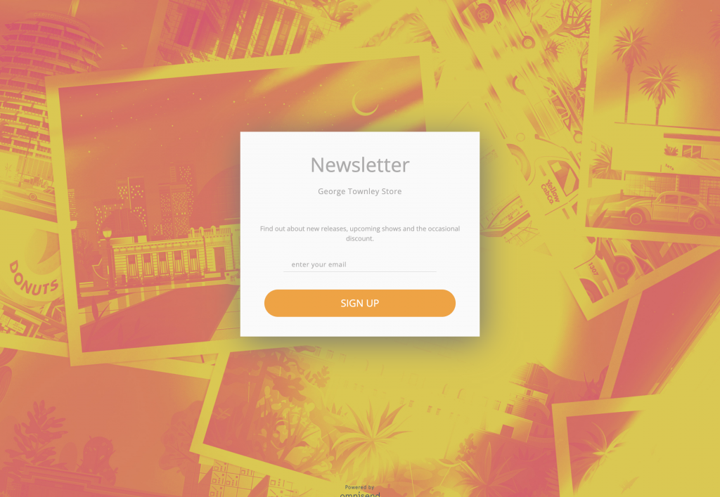
In this example, George Townley has incorporated his visual style into the sign up form page, plus tease some of the prints in the background which reinforces his sign up CTA:
Save the (launch) date
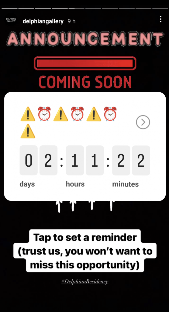
With your print sale just over a week away and to capture those in your audience who are interested, but not have signed up to your mailing list, use Instagram & TikToks native reminder tools to announce the launch print store launch.
We like this example by Delphian Gallery for its direct use of language and clear call to action. Keeping the message simple here in terms of what your audience will get by adding themselves to the list is key to good conversion.
Week 4: The print reveal
Print production process
Showing how the prints are made is a great way to build intrigue ahead of the sale. By communicating the quality and process you can begin to get people interested in the upcoming print range.
This video from Cat Machin shows that the prints are hand made on an individual basis and are high quality. This will give some context to the price being charged:
This video by Octavi Arrizabalaga is great because it show the care in packaging and delivery which is always a concern for buyers, plus it shows the limited edition numbers, and gives a sense of trust around the print quality:
This from PichiAvo really illustrates the scale of the prints. Graphically it makes clear the limited nature of the print run by showing the entire range of prints together:
The print reveal
Similar to your project reveal, this gives viewers the first up close look at the work in print form. You are teasing quality and detail in order to build intrigue ahead of the print sale.
This is a strong reveal video from Dustin Gibson. It shows the print quality really well, it also gives some sense of the scale, and is very clear when the sales start:
Whilst not a print, this reveal technique by Courtney Kinnare combines both scale and suspense. This style of short form content could be used to pepper your stories:
Show the scale of prints
This helps potential customers see the products as less abstract objects and instead how they may look in their house. It also helps contextualise the price.
We like this post from Daniel Mullen because it clearly shows the artist and creates a connection with the viewer. The studio setting conveys some sense of the work that went into creating the piece:
Danii Pollehn has really captured her unique style in this post. We really like the interplay here between the shadow and the price, it gives a lovely sense of the inspiration for the work:
Week 5: The print sale
Print sale live announcements
Communicate the countdown and launch of the print sale. This should build anticipation and help drive urgency within your followers. The CTA should be clear throughout to sign up for advanced access. Give specific times and dates.
We love this Instagram Reel by Liv Lee. By mentioning that the store has been years in the making, her caption cleverly creates demand. The free shipping CTA is clear along with descriptive product details. To top this, the video has amazing pace and tempo:
In this post, Gustavo Minas combines a visual of the print (which also shows scale) with a descriptive caption that includes great incentives to buy:
Show the print range
This shows potential customers the full range of prints available to purchase. The focus here is more on the product details, such as paper, edition numbers and price. It’s also good to provide some context on the project details for those who may have missed your earlier content.
This great post by Sander Patelski shows the print range together in a single show, which gives the sense of theme. It also helps people to pick one out they might be interested in:
We like this post from Tom Lewis. In a studio setting, Tom talks you through the range providing some personal details which allows for more of a connection with the product:
Show the prints on the wall
You are communicating to potential customers what the artwork may look like in their home. It provides a sense of scale allowing the product to seem less abstract encouraging the chances that they will buy.
It’s really important with statement pieces to show how they can drive the mood in the room, and this one does that very well. This is a great example of this by Franck Geradart:
Print despatch and unboxing
This is all about product quality and detail. A barrier to buying online is often the lack of customer service one gets from an in-store experience. Showing this is the value add which will help convert customers on the fence.
Great post from Circa art. It is well put together, a great track of course and it shows the careful packing and certificates. It also shows the amount of prints that have been sold, which conveys urgency to prospective buyers:
The close up camera angles, asmr-like sound and choice of background music by Carly Renee give the viewer a sense of real care having gone into the final preparation:
Share press coverage of the sale
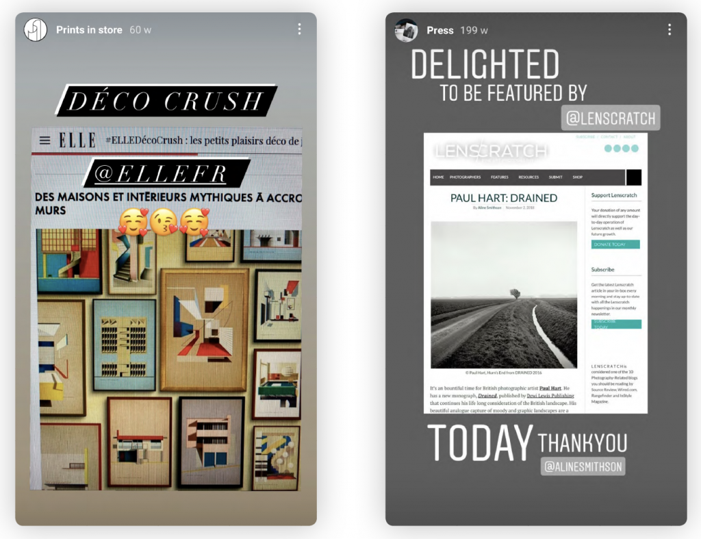
The aim here is to communicate your standing as an accomplished artist. This use of social proof will give potential customers confidence that they are investing in an appreciated artist. It also helps validate their purchase when talking with friends and family about the artworks.
With press, features and other forms of coverage you will almost always be tagged in their social content. Resharing this is a simple and modest way to communicate your coverage on an ongoing basis. Here are two examples of this by Sander Patelski & Paul Hart:
Week 6: The wrap
Thank you for the support
This is a humble and honest mark of gratitude. Communicate to your supporters what their support allows you to do and that future sales for those that missed will be announced via your mailing list with a CTA to sign up.
This is a great set of Stories & Reels from Prints for Wildlife. They make clear their gratitude, and importantly show their faces which helps reinforce an emotional connection with their audience of supporters.
Show off your happy customers
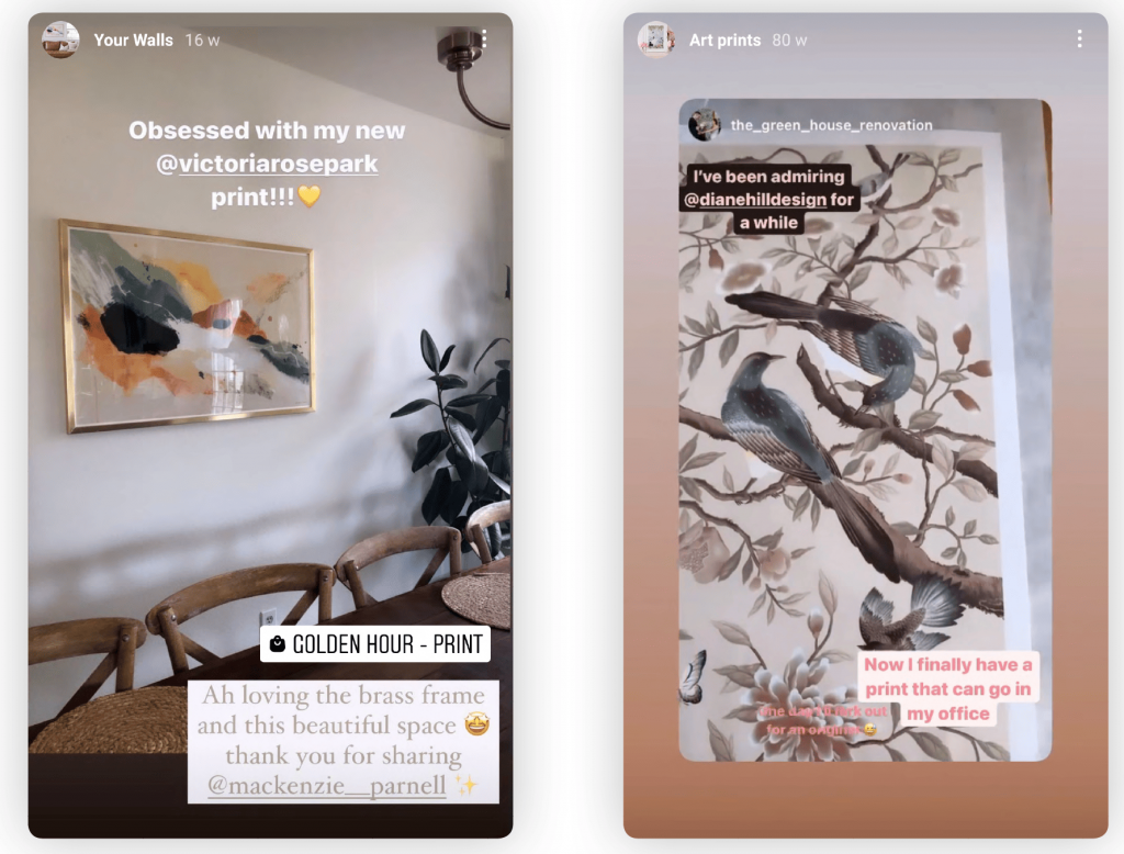
Thank your buyers by sharing an image of the work on their wall. Encourage your buyers to post their purchase and tell them you’ll be sharing.
Victoria Park & Diane Hill share all stories they are tagged in, then add them to a Highlight Reel. This gives future potential buyers a place to find these valuable testimonials.
Print sale recap
Close your print sale conversation with a recap of the past 6 weeks.
We like this video from Vital Impacts as it’s an emotive recap that highlights the quality of the work, the effort of all those involved and print sale success:
As you can see from the range of content examples we have given you in this article, running a time-limited print sale is a commitment. However, if you follow the structure laid out in this guide it is likely to be the single best technique you can adopt to drive urgency to your store and sell prints. So, if you are serious about selling art prints online, we would highly recommend you do between 1-3 of these per year!

