When someone clicks on your email newsletter, they are 4 times more likely to buy a print or an original artwork in your online store, than if they click from Instagram! That’s not to say Instagram traffic is bad, because IG traffic can be very high, but it does mean you should be looking to get your IG followers to sign up to your newsletter at every available opportunity!
For more reasons why email rocks for selling art online, read our article here. Simply put, your email subscriber list is your biggest asset. This article will explain how you can maximise the sales from this list, through sending the right content, at the right time and, when you are selling something, with the right design and text copy to make people want to buy.
Content and frequency thoughts
You should view subscribers to your newsletter as potential buyers of your work. However, to make that happen you need to nurture them with great emails!
People do not mind being sold to, especially when they love your work, but just not all the time. Value giving emails, where you tell great stories about you as an artist, or your work, will help you build engagement with your email subscribers, and this will positively affect your open rates. Here’s some ideas for the content of these value-giving emails:
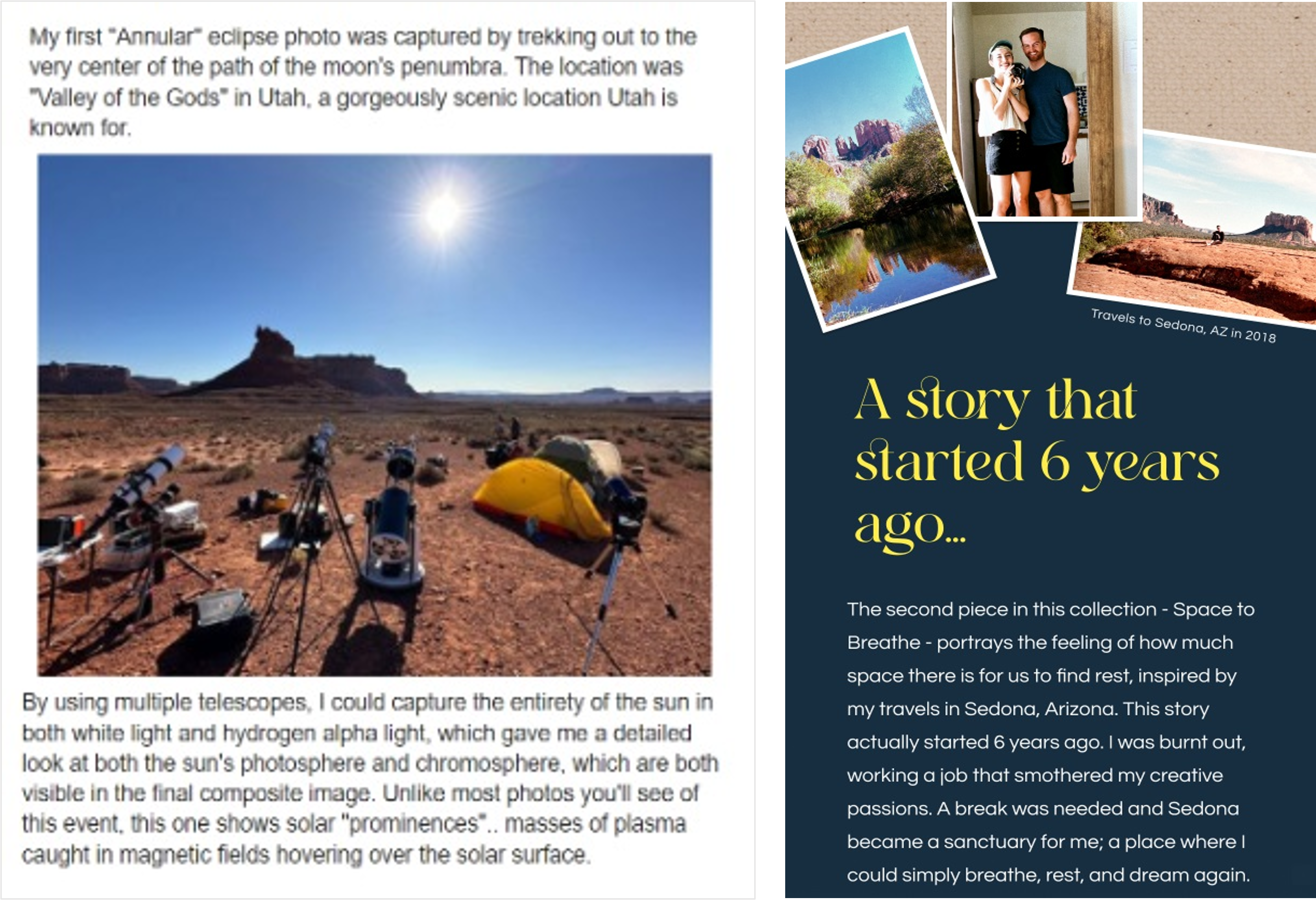
- An email about how you became an artist
- Something that gives some insight into why you make the work you do (read this book, it will really help with this)
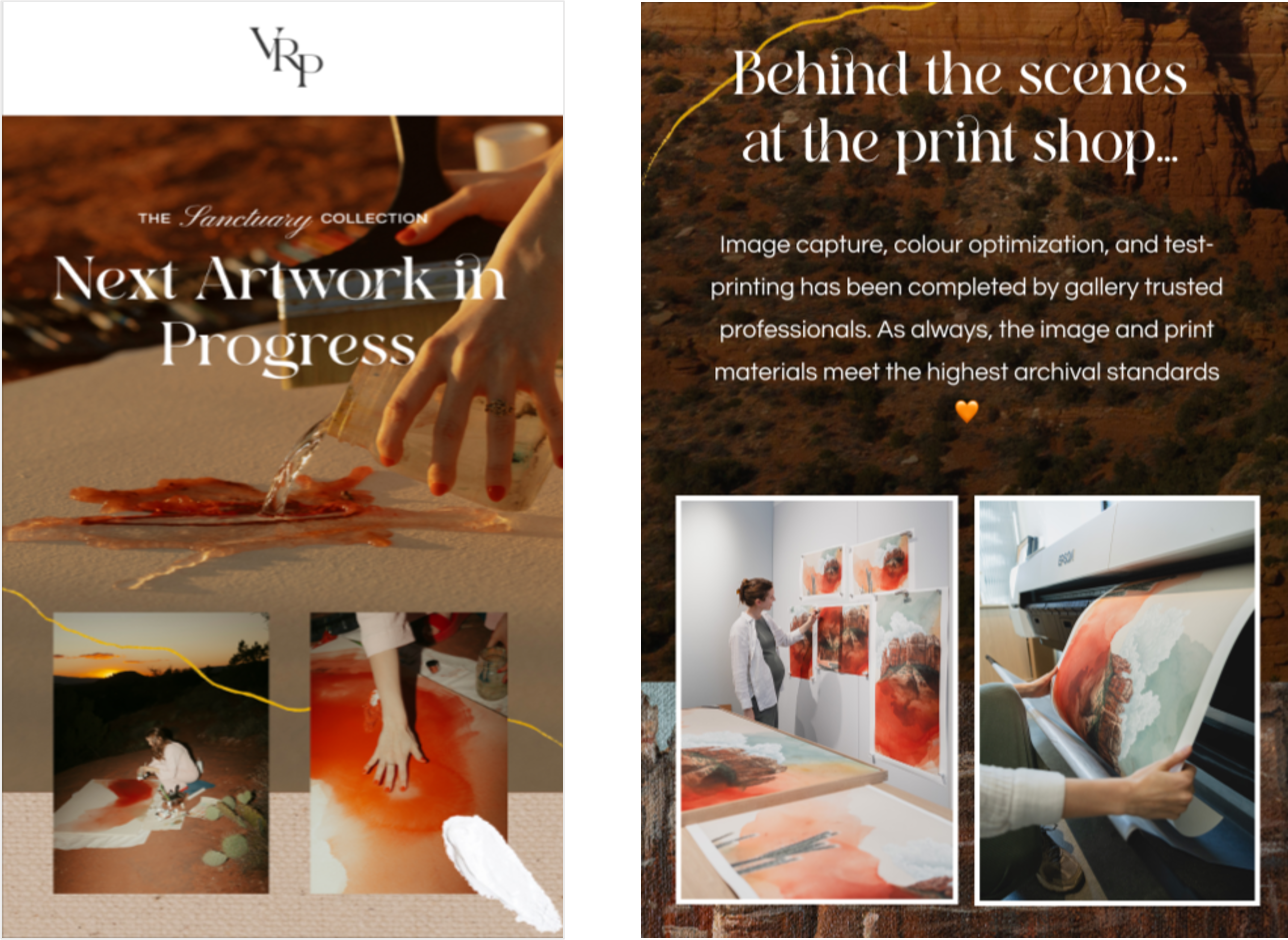
- BTS (behind the scenes) video or images showing how make your work
- Something that casts light on your inspiration and influences
- Pages from your sketchbook, or image from a location shoot
- Something personal
- A piece about the journey to make a particular piece
- Images from your studio and daily life
In terms of email frequency, there are no absolute rules other than you should send emails when you’ve got something interesting to say. Hopefully, as you’re an artist, you’re going to have lots of things to express!
Firstly, make it a habit to document thoughts, inspirations, influences that feed into your work. Not only will this help your art practice, it means you will have content to draw on when you write newsletters.
Think of email frequency like a conversation. You don’t speak every 10 minutes, you speak when you really have something you want to say. The value of the content you share in each email is more important than simply sending timely updates.
All the above will deepen the connection to, and understanding of your work.
How design can maximise conversions!
Ok, so now you’re ready to send an email about a timed print release you are launching. It’s time to design that email to absolutely maximise your sales. The overarching principles of this email are to; (1) create intrigue to open the email, (2) create urgency to click through (3) to give the wow factor to the work to start building the intent to buy. Let’s break these down one-by-one.
Maximise email open rate
Your open rate is the number of people who open the email, as a percentage of people who received it. This number averages 46% for artists whose print releases we run at theprintspace. If your subscribers are predominately more recent, this can be up to 75%.
The things that increase your open rates are:
- Your subject line and preview text:

Almost all email software allows you to split-test subject lines. This is where the email is sent to 20% of your subscribers with 2 options; 10% get option A and 10% get option B. The other 80% get option A or B depending on which option got the most opens (or clicks, depending on what you set test objective as).
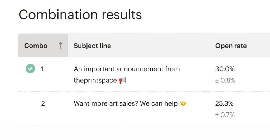
Your subject line options need to be catchy, and to avoid being over -descriptive and dull. They should build intrigue or urgency. You have to put yourself in the position of someone who doesn’t know what’s in the email. Why should they spend some of their precious time reading your emails? Here’s some ideas:
“My best EVER shot of the MOON 🌒”
“This shoot was crazy…..”
“Act now, this print is selling fast”
“My most liked print EVER ♥️”
“Here’s my crazy story of this artwork”
“I asked myself, why should I….”
“Never ever open this email 😲”
“12 hours before this print goes away, forever ⏳”
Of course, you need to do this in your own tone of voice. But the point of your write “A new A2 print is in my print store now”….you are not going to inspire many people to click. Your story will make it obvious the print or artwork is available. You don’t need to actually write that, and especially not in the subject line.
The preview text needs to obey the same rules; make it zing!
- The quality of the previous emails you sent will influence the open rates of all the following ones. This is why you should never, ever send dull emails. This will kill the potential of your email list. The good news is the reverse is true, great emails grow open rates.
Maximise click-through rates (CTR)
Your click-through-rate is the number of people who click on the calls-to-action , as a percentage of people who received the email. By the way, Calls-to-Action (CTAs) are the things written around the link, or on the buttons. They are basically the instructions of what you would like the person reading the email to do, e.g. “Get this print!” written on a button.
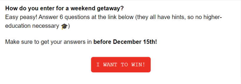
Maximising email CTRs is all about eye-catching design, and slick copy that builds urgency. Here’s some other important pointers for this:
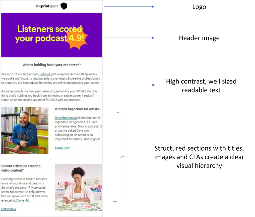
- Keep text point sizes on the larger size
- Create a visual hierarchy with your titles and sections
- Add your logo as it looks authentic, legitimate and positively impacts engagement.
- Don’t use multiple fonts, sizes and colours. Keep it clean, structured and easy to read.
- Keep the main message and CTA above the fold to draw maximum attention. People have short attention spans so avoid long emails with multiple scrolls.
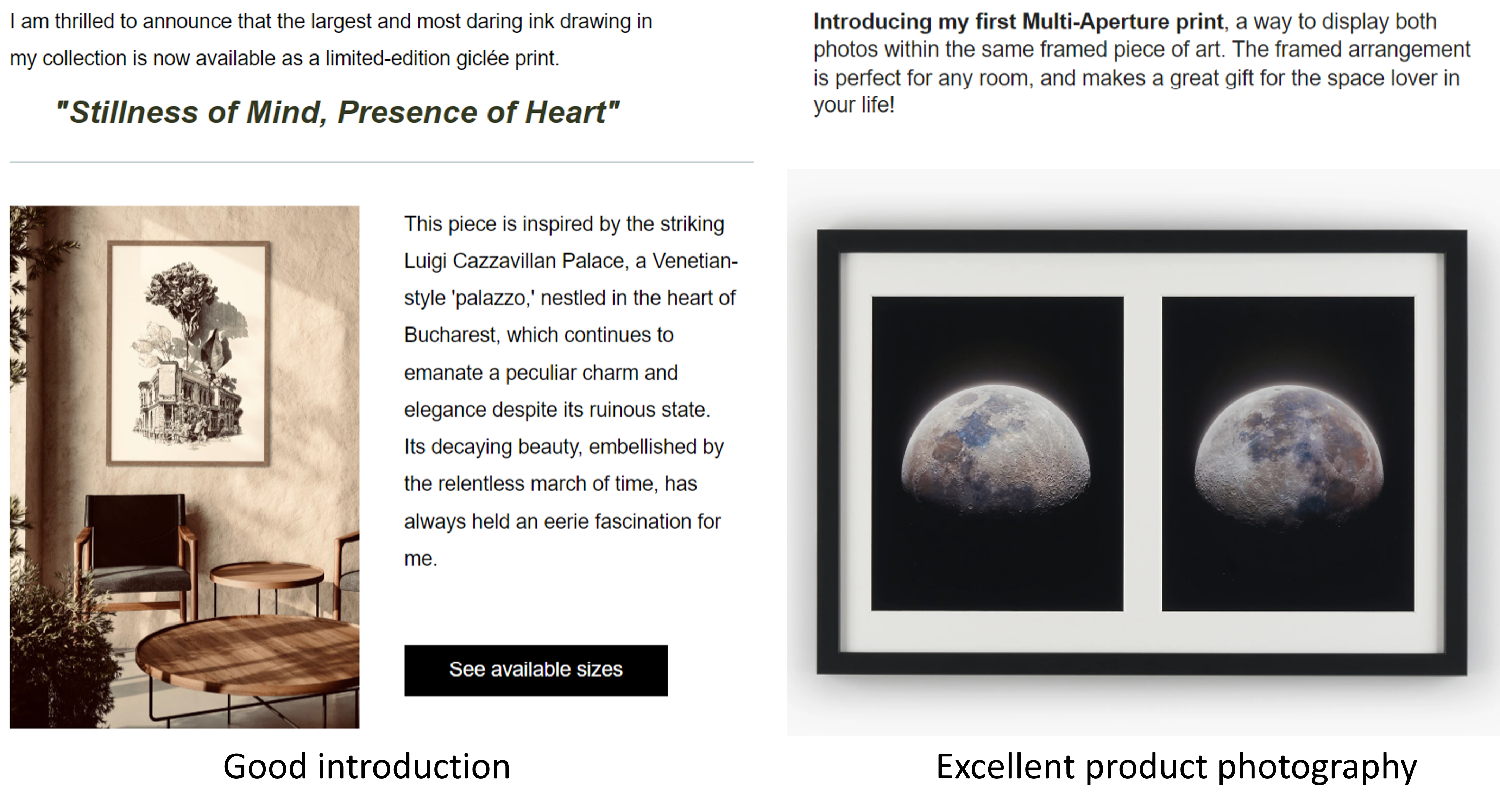
- Use bright buttons with clear instructional CTAs like ‘Shop Now’ or ‘Buy Now’ or or fun compelling CTAs like ‘I want In’, ‘Show Me Art’, ‘I ♥️ Free Shipping’ depending on your tone of voice. Something as simple as the colour and text of a button shouldn’t make such a huge difference…but it does! Conversion rates can vary widely from just the CTA. Also, use CTAs at the top, middle and bottom of your emails depending on how long your email is.

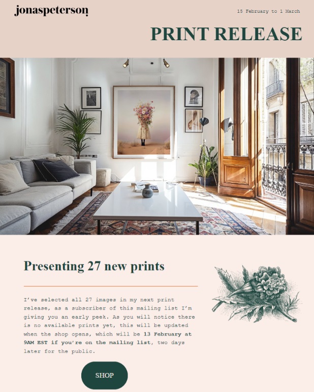
- Add interesting and high quality images of your work that you have not used before. Use good header images, product shots, mockups from Artplacer or Smartist in an aspirational room setting, or yourself with the print. Low quality, repetitive images make people switch off.
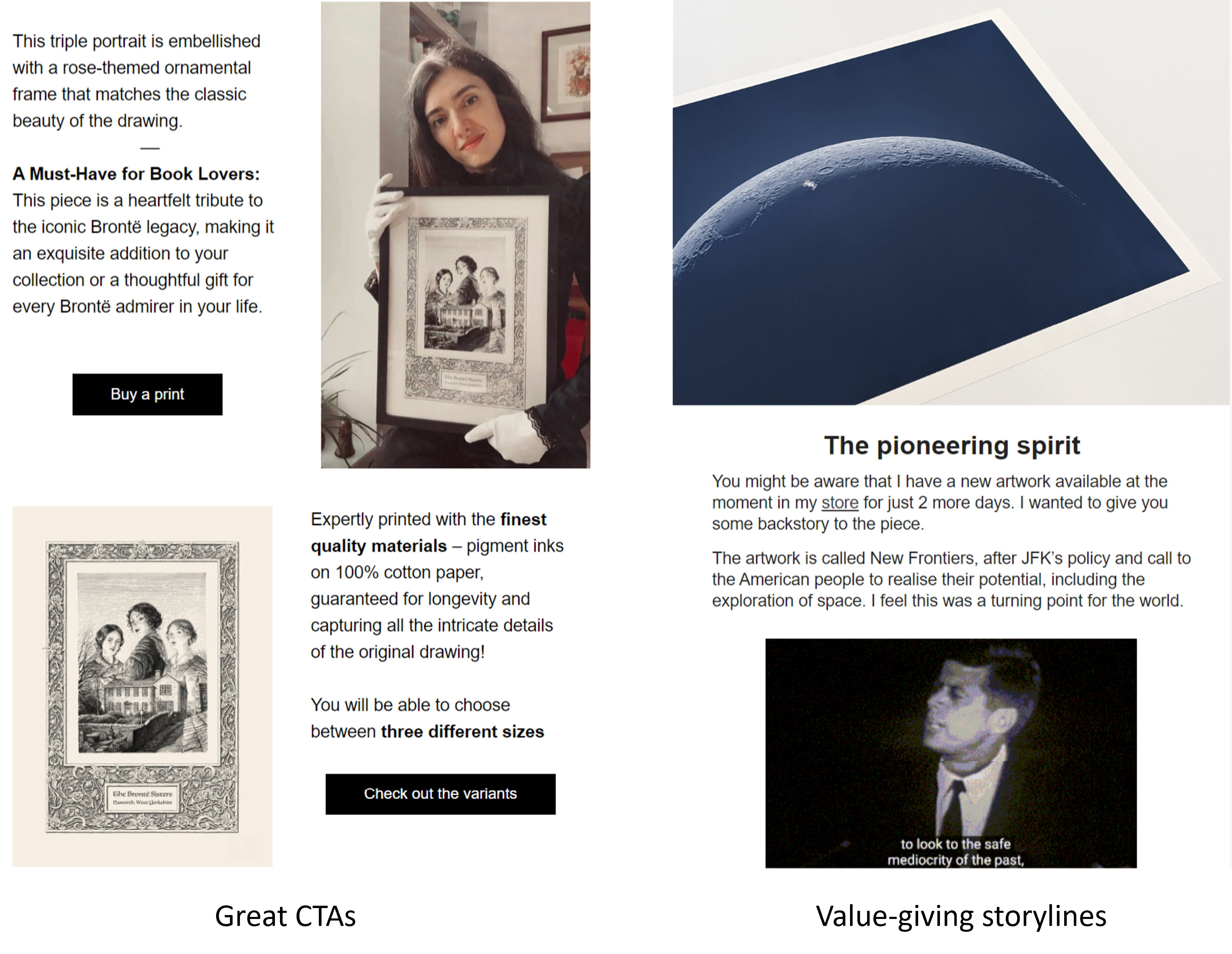
- Write the email in your own tone of voice, and make sure you add energy! Maybe write it when you feel really energetic rather than tired because if you don’t sound excited, how can you expect anyone else to be?
- Have the language of urgency throughout your subject lines and email content. Use text like ‘limited time’, ‘only available for 5 days’, ‘last chance’ etc to make sure people click through.
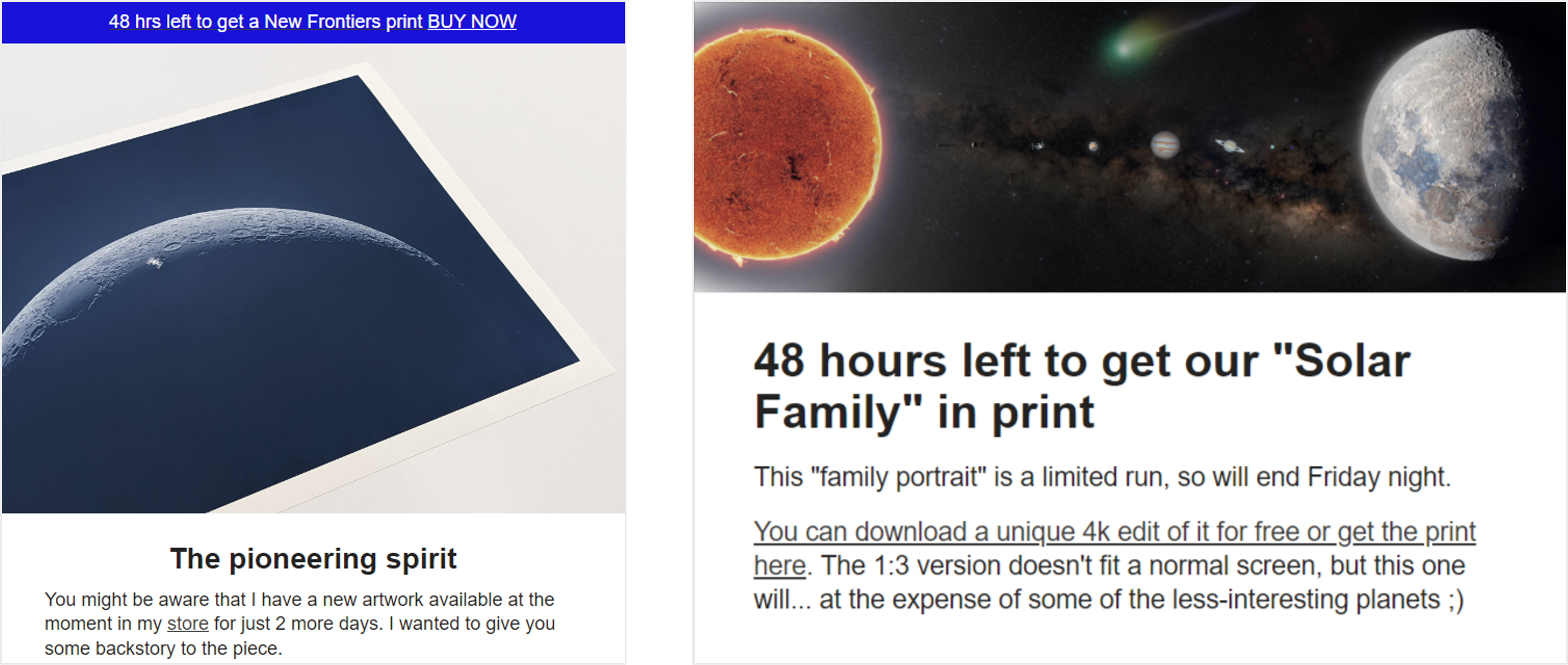
- Be personal, authentic, and just be you like you are writing to a really good friend about your work.
- Think of the message that you want to convey with the email. Add value with a new fact about your work or some WIP content.
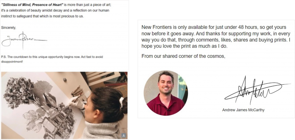
- Personalise the email greeting with your subscribers’ first names, like ‘Dear John’ You should be collecting the first and second names of your subscribers on your email signup forms.
- Add a touch of personalisation in your sign off message. Have a picture of you, a small message and signature when you sign off. People buy from people and this makes it feel more personal.
Right email at the right time
Depending on the duration of you timed print drop, we recommend either 2 or 3 emails around it:
The launch email
The launch email is for your subscribers to have exclusive access to your drop 24-48 hours before your general launch. It is vital to have language of urgency and scarcity throughout the early access email, with clear CTAs to buy the print.
A mid-sale value giving email
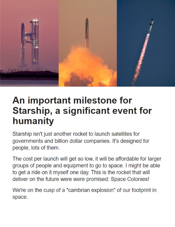
The value-giving email is usually sent mid-drop provided you have an interesting story associated with the artwork you are selling. It can be about the central theme of your artworks, a narrative or any other exciting news that you want to share with your audience. It does not need to be sales-focused but you can connect your story with the ongoing drop and add a link to buy. If your print drops are around 7-10 days then we recommend sending this email mid-week, otherwise you can focus on the last chance email.
The last chance email
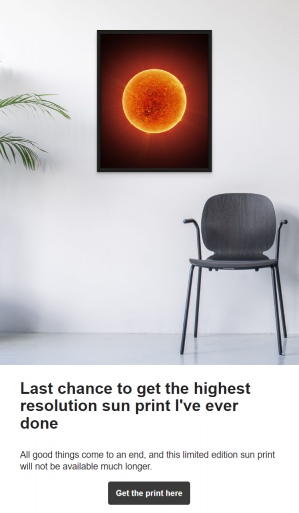
The last chance email is as the name suggests..last chance to buy a print. You want to thank everyone who bought a print so far and also let others know that it’s their last chance to buy. It acts as a nudge for people who might have visited your page and then thought they’ll buy later. Getting this email springs them into action and we usually see a huge spike in sales when the last chance email is sent out.
We recommend sending this 12-24 hours before your print drop ends but make sure you clearly communicate the urgency to take action by clearly stating when the drop ends and using words like ‘This print drop ends soon’, ‘Last chance to own this special print’, ‘Only 12 hours left’ etc.
Build your email list at all times, it is your biggest asset and is the channel that should drive the highest sales if you are doing it right! For more questions on art sales, do join our Facebook group where we review your art sales strategy and offer advice on what you can do to improve your results.

