Take a look at this landing page for one of the timed print sales we had run for one of our top sellers, Andrew McCarthy.
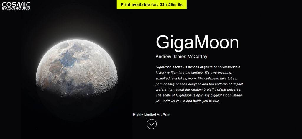
All the elements on this page are communicating the language of scarcity and urgency and the page is completely centred around the artwork that is being sold. The page is highly optimised for conversions so the only thing you can do when you land on the page is to buy the artwork. There is no other link to escape from the page. And that is really important because once you have convinced someone on social media to click through to your page, you want them to convert and not get lost around on your website.
Here are some pointers to keep in mind when designing your online art store for your timed print drops:
- Create a ‘wow’ moment for your visitors when they land on the page
- Limited text, no clutter, artwork is the front and centre of the page
- Focus on creating a responsive page so you don’t see below the fold on any device
- No navigation menu so people don’t have an option to go other parts of the website
- Sticky, bright coloured countdown timer at the top of the page that keeps counting down the time left in the sale, building urgency
- “Highly limited art print” again emphasises on urgency
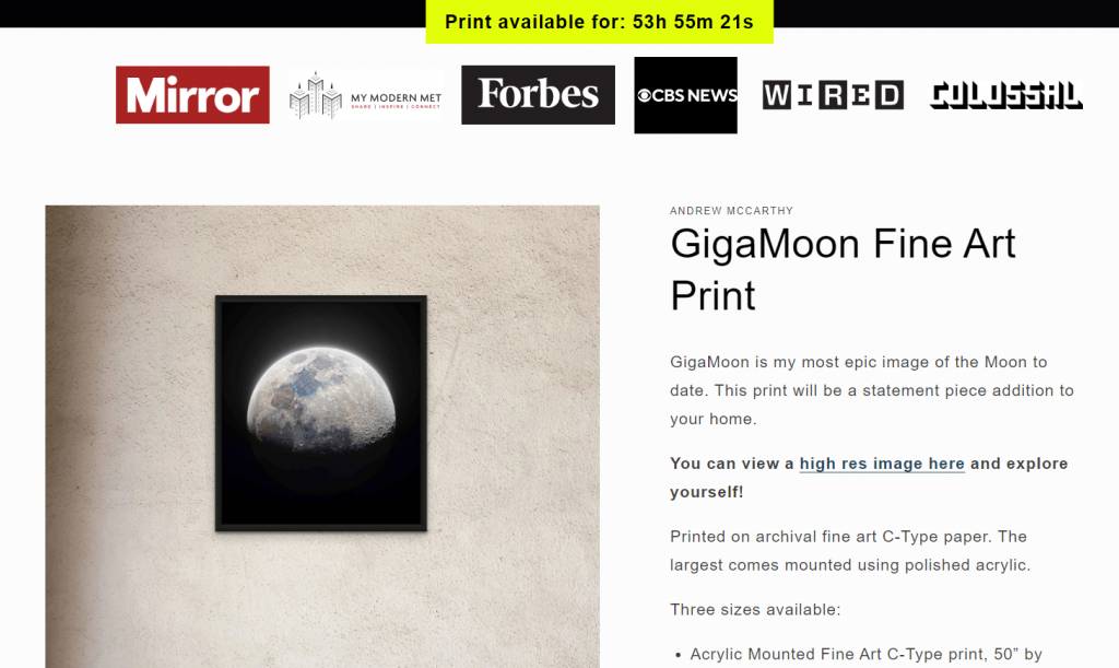
7. Add any links to publications or articles where your work has been featured to create trust with your audience (optional)
8. Great product shots so you can see the details of the print and a concise product description to give the basic information about the artwork
9. Limited availability message is again highlighted in red so it’s easily noticeable
10. Size, price and delivery details as these are the most common questions on your buyer’s minds
11. Buy button is again in a bright, high contrast colour so you can easily identify the next step to initiate the checkout process. The two brightest buttons on the page should be your timer and the add to cart button because they are the two main things tour buyers need to know – how much time is left and how to buy
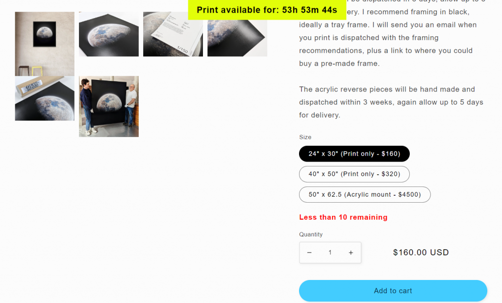
12. Shipping prices and delivery information are mentioned clearly to reiterate how the prints are shipped. Do mention if it’s sent via express courier or postage so your buyers know what they are paying for
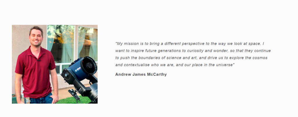
13. A small quote or message from the artist about their work to personalise the page. You can talk about your inspiration for the artwork and why you chose to make that particular piece of work.
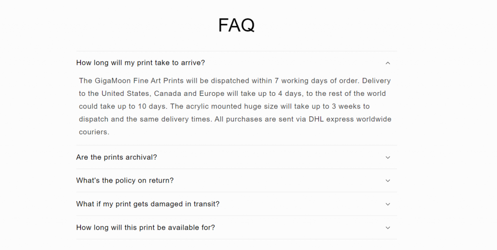
14. At the bottom of the page you add the most asked questions about the print sale that your buyers would like to know about. This can again be about print quality, delivery timelines and returns & refunds.
Keep these basic pointers in mind when you’re designing your landing page because this will help in improving your conversion rates. Your page only acts as the final point of sale for your customers so every information you add to it should help in increasing your art sales.

