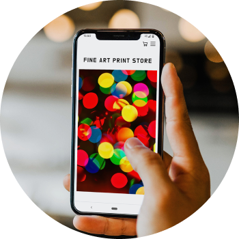
You need the language of urgency in your store when you are doing print drops. It needs to be a single page with no escape so all you can do is buy. You can’t even click the logo or go to any other page on the website. You don’t want people to browse around your site, because when you’re doing a timed print sale, all of your marketing, all of your posts are about that print.
Your link from your link in bio goes straight to the landing page and on the landing page you can’t do anything other than click back or buy and go through the checkout process. And that’s really important. The language of urgency needs to be all across it. You need to have a really clear timer at the top of the page.
If you don’t have all these elements on your page then the conversion rate will be lower. If people can browse around, see other stuff, it’s going to distract them. They’re going to think they’re not quite sure which print they want and that they will come back and do it another time. And of course, people never come back because life takes over.
Here’s what we recommend in terms of the page design:
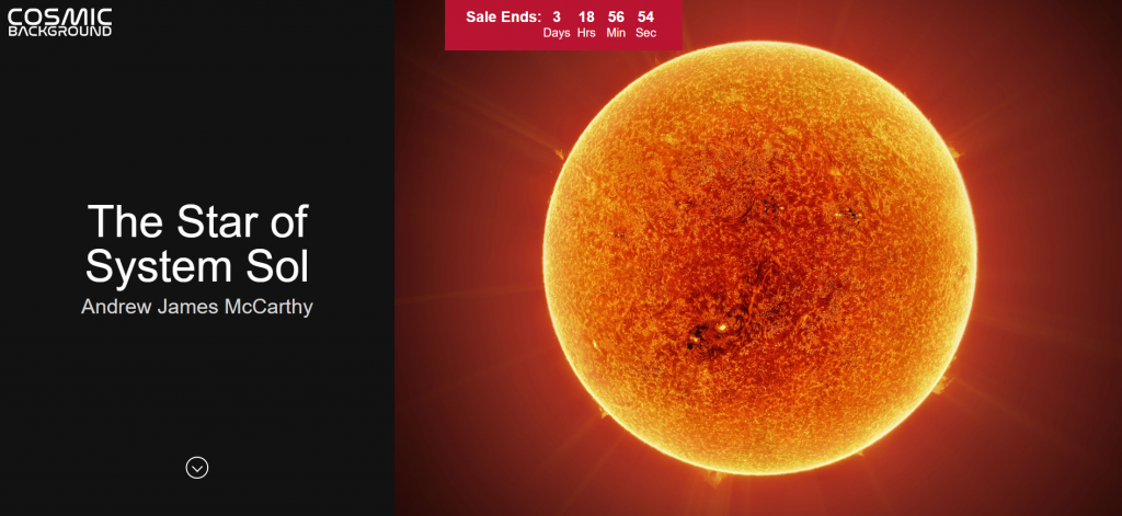
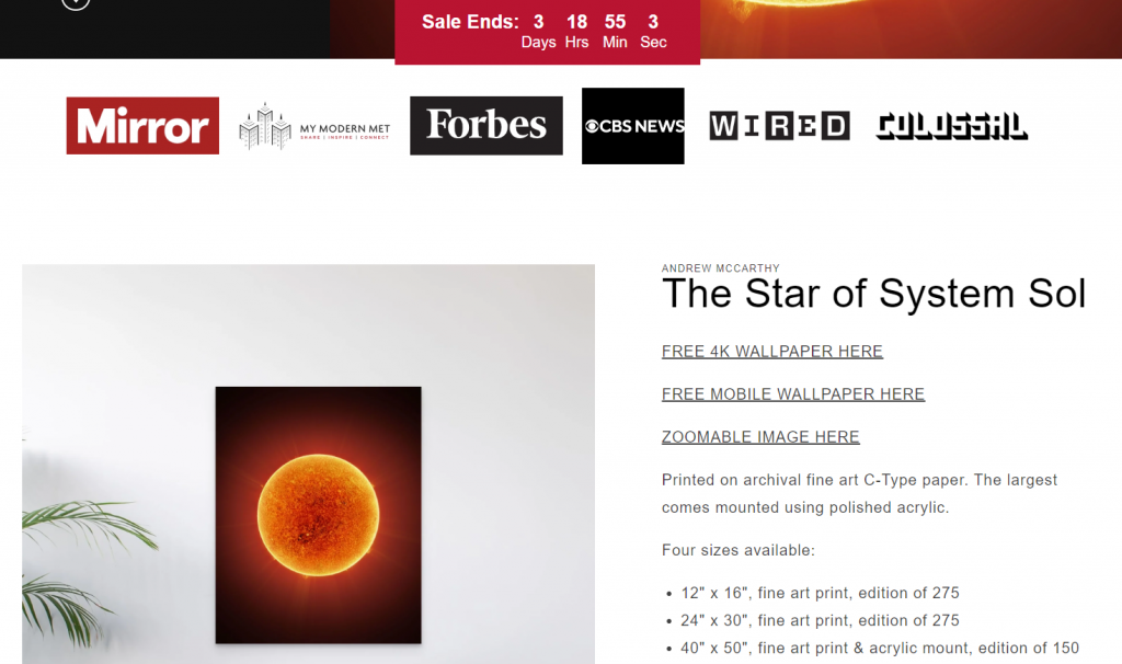
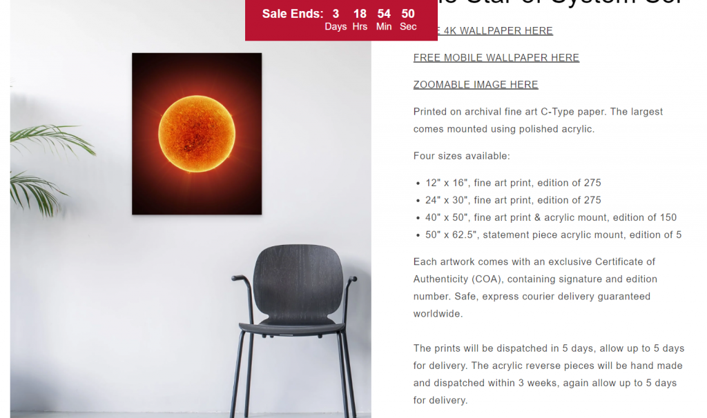
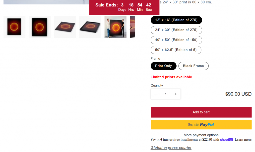
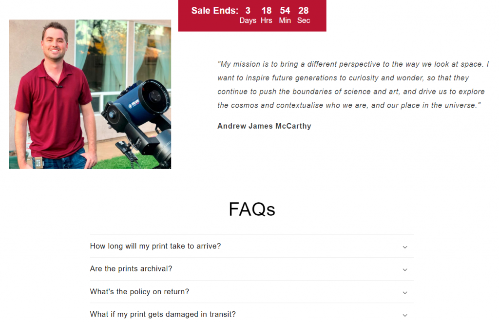
First things first, the artwork is really big. The page is nice and simple. The language is already building up the urgency, highly limited, countdown timer at the top, can’t escape by clicking the logo. This is followed by a picture of the artist with some personalised text about the artwork. Now when someone’s making their selection, you should be able to see the artwork scale when you’re making your selection. That’s really, really important. And just the pertinent details like the price, it’s all on one screen there. That’s really, really vital to conversion. And then a bit of FAQs which are the most important thing. How long will it take for the print to arrive? That’s super important for Christmas. If it’s a gift, people want to know if it’s gonna be there on time.
It’s just all about simplicity, focus on the artwork, being able to see the scale of the artwork as you change the option buttons. And then the checkout process is really straightforward because it is Shopify. Don’t let people hesitate. Don’t make the checkout process complicated. The thing about Shopify checkout is that it will recognize you if you have checked out on any other Shopify website. So no typing is required to check out because friction in the checkout process is just an absolute conversion killer.

